
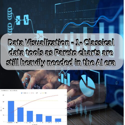
Classical data tools won’t die in any nearby future time. They are still needed to present the results of sophisticated and complex data analysis to the human mind.
AI can be programmed to validate input data and confirm that it is not rubbish. Because even for AI and machine learning, rubbish data in will result in rubbish results of the data analysis. However, AI can’t realize biased data. This means that we still need to rely on human intelligence to detect unfairness or biased analysis results. Without real understanding of the classical data analysis tools and representation we won’t be able to understand and trust the results of the AI driven data analysis.

Maintenance Coupons

Maintenance Coupons
Moreover, for any medium to small size business the cost of AI and machine learning tools is unjustifiable. So they still rely on the human skills for the data analysis and visualization. Even for big firms that can invest on the finest AI and machine learning tools and algorithms, there is still a doubt of who will be hold accountable for the correctness of the data analysis.
Why we still need the skills of the Classical data tools?
AI technology allows us to explore and understand large data sets more quickly and efficiently. Supposedly enabling us to make more informed decisions. However, we need to know how to interpret the charts that will result from the AI data analysis. AI generates content for data visualization. That’s where AI is powerful at. Quickly, effectively and efficiently processing a huge amount of data. Yet we are left with interpreting of this data based on our experience in understanding data results and charts.
Data visualization is the process of creating graphical representations of information. This process helps the presenter -whether human or AI – communicate data in a way that’s easy for the viewer to interpret and draw conclusions.


There are many different techniques and tools you can leverage to visualize data. This series is to know which ones to use and when. We had started by one of the most relevant tool to our daily maintenance and management work which is the Pareto Chart. We expect that all maintenance team and professionals would like to know in order to take and understand data-based decisions.
Data Visualization Tools
An important note before we start is that same chart carries different names. That’s because we can use same method of data preparation for visualization in different techniques. For example bar charts and column charts are the base method for Histograms, Pareto charts and Tornado diagrams. The difference is in how your prepare and sort the data and what categories you chose for the vertical and horizontal axes.
Also the preference of the viewer varies. Some viewers when the want to compare data sets prefer line diagrams. While others for same task prefers the Spider or Radar Charts specially when comparing limited number of categories. When we come to line charts, if we use time as the horizontal access we call them Run charts, timeline, time charts or, chronological charts. If we add some vertical lines as limits to see when the time chart crosses these limits we label them as control charts.

For Latest Coupons: Digital Skills Training

For Latest Coupons: Digital Skills Training
Moreover, colored representation methods for data is not used only with bar or line charts to distinguish different data series. Risk matrix, heat maps, highlight tables and many others fit data in table and color them based on your settings. So red blocks represents higher risky operations or delayed tasks and green blocks represent the safe zone.
Combining different methods as cumulative data over time with column charts results in Pareto charts and control limits. Even the cumulative data for example, we can use it to accumulate data against time or categories. And, we or the AI can plot it as area chart or as line chart.
Pareto Charts
A Pareto chart is a visual tool that combines both a bar chart and a line graph. It helps identify the major factors contributing to a problem or set of data. Pareto Charts is used to present the 80-20 Rule. The 80-20 rule proposes that 80% of the problems result from 20% of the causes. Or in other cases, 80% of the effort is directed to 20% of the tasks
The Pareto Chart is a very powerful tool for showing the relative importance of problems. It contains both bars and lines, where individual values are represented in descending order by bars, and the cumulative total of the sample is represented by the curved line. An 80% cut off line is also included to indicate where the 80/20 rule applies i.e. the vital few factors that warrant the most attention sit under the 80% cut off line.
Maintenance Coupons
Maintenance Coupons
Here’s a simplified example of a Pareto chart:
Let’s say you are a maintenance reliability engineer and you want to analyze the most common causes of equipment failures in a manufacturing plant over the past month. You have collected data on the downtime of different failure modes.
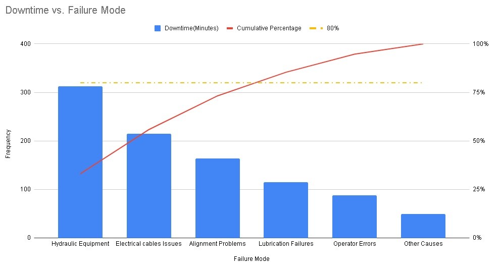
Here’s how the Pareto chart is relevant to reliability:
- Failure Analysis:
- Application: to identify and prioritize the most significant failure modes.
- Use in Reliability: By plotting the frequency or impact of different failure modes, you can quickly identify the vital few issues that contribute the most to equipment downtime or performance degradation. This helps focus efforts on addressing the most critical reliability concerns.
- Root Cause Analysis (RCA):
- Application: to identify the most common root causes of equipment failures.
- Use in Reliability: It helps in focusing efforts on addressing the underlying causes that have the most substantial impact on reliability. This, in turn, contributes to more effective preventive maintenance and reliability improvement strategies.
- Maintenance Prioritization:
- Application: to analyze maintenance data and identify the most common types of maintenance tasks.
- Use in Reliability: By understanding which types of maintenance activities contribute the most to overall maintenance workload, we can allocate resources more efficiently. This aids in prioritizing preventive and corrective maintenance tasks based on their impact on reliability.
- Equipment Criticality Analysis:
- Application: by plotting the impact of different equipment or components on overall system performance.
- Use in Reliability: Identifying the most critical equipment or components helps in prioritizing maintenance efforts. Then we focus on the critical few components that significantly affect overall system.
- Spare Parts Management:
- Application: apply to spare parts usage data to identify the most commonly used or critical spare parts.
- Use in Reliability: By prioritizing the management and availability of critical spare parts, the organization can ensure quicker response times for repairs, minimizing downtime and improving overall equipment reliability.
- Risk Management:
- Application: identify and prioritize risks associated with equipment failures or performance issues.
- Use in Reliability: By understanding and prioritizing risks, reliability engineers can develop risk mitigation strategies that address the most significant threats to equipment reliability.
For Latest Coupons: Digital Skills Training
For Latest Coupons: Digital Skills Training
In Conclusion,
There are many different techniques and tools you can leverage to visualize data. This series is to know which ones to use and when. We had started by one of the most relevant tool to our daily maintenance and management work which is the Pareto Chart. Without manipulating data to be useful information that can add to our knowledge and help us take data-based decisions, there would be no meaning for collecting this huge amount of data we are storing right now.
In this chat we can clearly see the importance of data visualization. Data visualization tools gives meaning to the data. Moreover, you can give the data several meaning by manipulating it differently or comparing it to different control limits. Also, we delved deeply in the Pareto chart and the 80-20 rule with an example from maintenance.
In the coming chats we shall share some of the most important data visualization techniques. Also we shall see how different manipulation of data can yield different results and hence different data-based decisions. We expect that all maintenance team and professionals would like to know these skills in order to take and understand data-based decisions.
If you feel you need help with any of these ideas we discussed, request a Management Consultancy or Coaching Services From our Store


One Comment