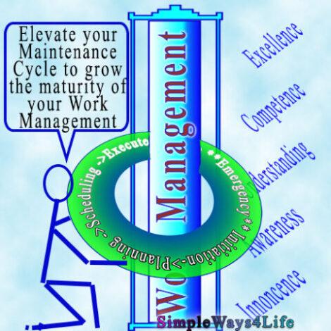
Reliability is not a one-stop shop. It is not a one time activity. Reliability is a culture but culture changes with time. Culture is constantly affected by the business environment. This can drag the cultural concepts out of the door unless we hold on to. This might open the doors to new concepts that better match the current context. Or, it could leak away some of our gains from applying Reliability.
Similarly, Reliability concepts at one point were introduced into our culture. Unless we hold on to the Reliability concepts, it can slip out of our business environment. But how hold on to the Reliability culture we once achieved? Simply we need to keep monitoring the Reliability results we attained.
Maintenance Coupons

Maintenance Coupons
Do Run Charts run only against time?
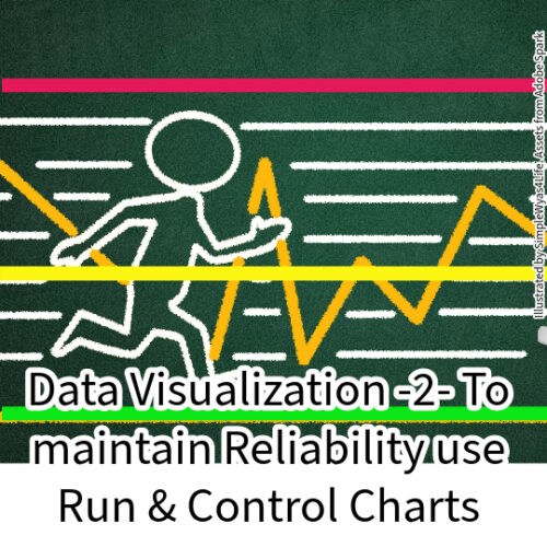
Run charts display data points in chronological order, helping to identify trends and patterns over time. It is useful for visualizing data trends and changes, leading to the identification of critical periods or factors.
You could plot any two interrelated values or even any two random values against each other. So for every pressure, you record the flow value. Or, for every voltage reading you record the motor current. Then you find that you need also to record the loading condition which jointly affects the current as the supply or the drive voltage. But, all these values has a finite range of change and then the values repeat again. AI and machine learning try to find relations between any two set of data and then formulate it and use it to predict one of the values knowing the other one.

For Latest Coupons: Digital Skills Training

For Latest Coupons: Digital Skills Training
But all these are not Run Charts because they can’t run for indefinite values. Only time can run forever. So, whatever you record against time can simply inform us how a certain value or a group of values changed between two points in time. This can happen regardless of how long is the time gap between them. The limit is your data storage capacity. That’s why plotting any value against time is a called a Run Chart. It is running for ever.
What are Run Charts vs Control Charts?
For example you can use Run Charts to represent the downtime hours for a specific month. The trendline helps visualize the overall trend in downtime hours over the year. The core value behind this chart is that it allows you to observe patterns, spikes, or trends in machine downtime over time, aiding in decision-making and identifying potential areas for improvement. Viewing data over time gives a more accurate conclusion rather than just summary statistics.
A run chart is similar to a control chart. The key difference is that Run Chart can reveal shifts and trends while, Control Chart reveals process stability. Since the run chart does not have control limits, it cannot detect out-of-control conditions. However, it will graphically depict how the process is running. You can turn a run chart into a control chart by adding upper and lower control limits.


The goal of control charts is to see the results consistently fall within the control limits. On the control chart, both upper and lower control limits are defined. Typically, control limits are defined as standard deviations from the mean. If the results fall within the control limits, then the process is stable; otherwise, it suggests that the process is not stable.
You can add control limits to any Run Chart e.g. for downtime chart. Then you can detect if you are still within acceptable limit of monthly downtime or you are about to pass the limit then, you need tighter controls and more attention. Maybe delve more into more analysis using more tools to sustain Reliability which is our only target.
Where we can use Run and Control Charts?
Run charts are valuable tools in reliability engineering for monitoring and visualizing the performance of systems, processes, or equipment over time. Here are several ways in which run charts can assist in reliability:
1. Trend Analysis:
Run charts provide a visual representation of data points in chronological order. This allows reliability engineers to observe trends and patterns over time. Surely you could use any AI supported tool available to give some recommendations about the trend. However, try to use your own analytical muscles between now and then in order not to lose your skills. Monitoring trends helps identify whether the reliability of a system is improving, deteriorating, or remaining stable.
2. Early Detection of Issues:
By regularly updating and reviewing run charts, reliability engineers can quickly detect deviations from the norm. Specially in process parameters and results data. A motor that is normally withdrawing 100 Amps will withdraw the attention of the reliability engineer when it starts to consume 120 Amps constantly even it is under the protection limit. Why? Because this signifies that something changed either within the motor or within the load. Early identification of issues allows for prompt investigation and intervention, preventing potential failures before they escalate.
Maintenance Coupons
Maintenance Coupons
3. Process Stability:
Specially when control limits are added, charts are effective in monitoring the stability of a process. Consistent and predictable performance is a key indicator of reliability. Sudden shifts or erratic behavior in the chart may signal instability, prompting further investigation into the root causes.
4. Performance Metrics:
Reliability metrics, such as Mean Time Between Failures (MTBF) or Failure Rate, can be plotted on run charts to track changes in performance. This allows for a clear understanding of how well a system is meeting reliability goals over time. This will be more value added if you know the values within which you want the MTBF to be stable.
5. Identifying Improvement Opportunities:
If you have a production target or even an electric grid quality target as 3rd harmonic level and, you see that these values are achieved within certain times, you will be able o focus on those times, conclude how those figures were reached and repeat these conditions again and sustain them. So, Run charts can highlight periods of improved or deteriorated performance. Analyzing these periods helps identify factors that contribute to reliability, facilitating the implementation of targeted improvement strategies.
6. Change-Impact Assessment:
When changes are introduced to a system or process, run charts provide a visual means to assess the impact of those changes on reliability. This helps in understanding the effectiveness of modifications and adjustments. The key factor is to know which parameters you will monitor. It is advisable to monitor most of the recorded parameters even they seem irrelevant for a period. Then, you can focus on a short list of the parameters that you are now sure that they were affected by this change.
For Latest Coupons: Digital Skills Training
For Latest Coupons: Digital Skills Training
7. Documentation and Reporting:
Run charts serve as a form of documentation, capturing the historical performance of a system. They also facilitate communication among team members and stakeholders by providing a clear and easily interpretable visual representation of reliability data.
8. Decision Support:
The historical context provided by run charts aids in making informed decisions. Reliability engineers can use run charts to support decision-making. Whether it’s allocating resources, implementing maintenance strategies, or considering system upgrades, the historical context provided by run charts aids in making informed decisions.
9. Comparative Analysis:
Run charts allow for the comparison of reliability performance across different time periods, equipment, or processes. This comparative analysis aids in identifying areas that may require additional attention or resources.
In Conclusion,
Run charts are a valuable tool in reliability engineering for continuous monitoring, trend analysis, and decision support. They contribute to a proactive and data-driven approach to managing and improving the reliability of systems and processes. When we add control limits to them, we change the label to Control Charts. The target behind the control chart is to verify the stability of the parameters under tracking within certain limits. But how to build a system around data visualization? That’s would be the target of our next chat.
If you feel you need help with any of these ideas we discussed, request a Management Consultancy or Coaching Services From our Store