
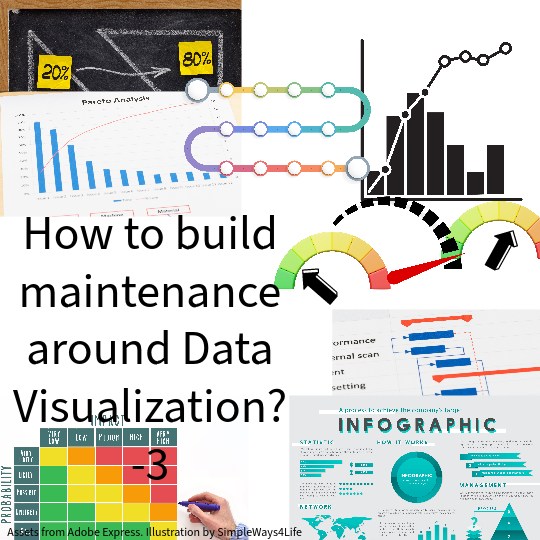
Data visualization plays a crucial role to improve maintenance by providing a clear and intuitive way to understand complex data, identify patterns, and make informed decisions. Here are several ways to use data visualization in the context of maintenance:
1. Failure Analysis:
What is more important for a maintenance team than knowing where to focus their efforts. That’s crucial to create a value added maintenance. One of the easy and excellent tools can be:
- Pareto Charts: Create Pareto charts to visually highlight the most significant contributors to failures. This helps prioritize issues for focused attention and corrective action. More insights about using Pareto Charts can be found in our previous chat: Data Visualization – 1- Classical data tools as Pareto charts
Maintenance Coupons

Maintenance Coupons
2. Equipment Performance:
How to define equipment performance? Example the pressure delivered by a pump against time. If pressure drops, this can indicate some wearing. While if pressure increase it can indicate some clogging. Another example is for electrical motors current. A decrease in current can indicate slippage in the coupling whether belts coupling or hydraulic coupling. An increased motor current can indicate some problem in the load.
- Trend Analysis: Use line charts or trend graphs to track the performance of equipment over time. This allows for the identification of patterns, deterioration trends, or improvements.
3. Maintenance Planning:
Usually we argue whether maintenance is a project or a recurring process. Either ways we can use some of the classical project management tools as Gantt Charts to properly streamline various maintenance tasks and prevent any conflicts.
- Gantt Charts: Utilize Gantt charts to visualize maintenance tasks’ durations, interlinks between tasks, their dependencies and the impact on operations. This helps in understanding the overall efficiency of the maintenance performance.

For Latest Coupons: Digital Skills Training

For Latest Coupons: Digital Skills Training
4. Reliability Metrics:
After selecting which KPIs are important to follow up, adding them to a dashboard will make it easier for maintenance supervision to see the trends of performance. An early rectification decision for any slow down in the maintenance performance surely pay off.
- Dashboard Displays: Design dashboards that provide a comprehensive view of key reliability metrics, such as Mean Time Between Failures (MTBF), Failure Rate, and Availability. Dashboards allow for real-time monitoring and quick decision-making.
5. Root Cause Analysis:
Treating the apparent cause of failure might quickly return the equipment back to operation. However, the probability that same error occurs again is unavoidable. Digging a little deeper about the real cause of a failure specially a repeated one pays off the effort.
- Fishbone Diagrams: Create fishbone diagrams to visually represent the potential root causes of failures. This aids in understanding the complex interrelationships that contribute to reliability issues.
6. Preventive Maintenance Optimization:
It is a matter of where to focus your efforts. So if you rated the maintenance chronic problems from the criticality or effect point of view and multiplied this by the likelihood of occurrence of such a failure then you will be able to spot where you need to focus your efforts.
- Heat Maps: Utilize heat maps to visualize the frequency and criticality of different failure modes. This helps optimize preventive maintenance strategies by focusing efforts on the most critical areas.


7. Equipment Health Monitoring:
That’s not far from KPIs or performance dashboard. But, this time the colored indications and gauges on the screen displays the values collected via condition monitoring equipment or PdM results. Condition Monitoring data are collected via permanently installed sensors or manually collected data. Usually PdM indicators were derived from the Condition monitoring readings. However after AI introduction to most software packages, we can derive early failure alarms or deterioration signs using all the data logged tot he system. AI scans all the patterns in the data series till time of failure. Then if these trends are repeated again, It raises a flag that a similar failure to that one is expected again.
- Condition Monitoring Displays: Implement visual displays that show the real-time health status of critical equipment. This can include color-coded indicators for various parameters and thresholds. The important settings we need to add to the indicators are the green, yellow and red zones
8. Failure Mode Distribution:
Histogram needs a continuous base or x-axis that we divide into steps. If we use discrete failure categories in the x-axis, it will be more like a Pareto Chart. So you can use in the x-axis the days of the month and the failures in each day. Or, the failure duration 0-30min, 30-60min and so on. Or you can use failure repetition; 1-3 times 4-6 times and so on.
- Histograms: Use histograms to depict the distribution of failure modes. This provides insights into the most common types of failures, facilitating targeted preventive measures.
Maintenance Coupons
Maintenance Coupons
9. Growth Analysis:
It is chart plotted against time but the collected values are accumulated or integrated. As if you plot the daily failures against the days but the value recorded at each day represents the accumulated downtime since the start of the month till this date.
- Cumulative Distribution Function (CDF) Charts: Employ CDF charts to visualize the cumulative growth of a value over time. This helps assess the effectiveness of reliability improvement initiatives.
10. Spare Parts Management:
Any of the above charts can be used to describe the spare parts storage. Example the total value of the stored spares over time. Or the stored value of spare parts against categories as consumables spares, assets or Electrical , mechanical, etc. Or, you may plat the value of spares in the store for more than 2 years, 1 year, 6 month and so on to catch stagnant items.
11. Process Flowcharts
You can chose any process and represent it graphically as a process flow chart so it can be easily understood. This can be applied to the regular operation or maintenance processes. Or new process as Reliability-Centered Maintenance (RCM) Analysis or FRACAS or FMEA when they get introduced to the team. The target is to generate an understanding of where we start from and what is the step flowing what we had reached so far.
- Flowcharts: Create flowcharts to visually represent the decision-making process in RCM analysis. This enhances clarity and understanding of the chosen maintenance strategies.
For Latest Coupons: Digital Skills Training
For Latest Coupons: Digital Skills Training
12. Support Training and Awareness:
You can use infographic for the visual representations of information, data, or knowledge intended to present information quickly and clearly. They can improve cognition by using graphics to enhance the human understanding and remembering of the information. You can use it to spread some information about the different types of bearing. Or, even you can use it to teach the team what to do during an emergency or the communication protocol. It can be used to create more interesting flow charts than just arrows, blocks and decision points
- Infographics: Develop infographics to communicate key maintenance or reliability concepts, metrics, and goals. This aids in training and raising awareness among personnel.
Benefits of Data Visualization in Reliability:
- Improved Understanding: Visual representations simplify complex data, making it easier for stakeholders to understand reliability trends and patterns.
- Quick Decision-Making: Visualizations provide a rapid and intuitive way to identify issues, trends, or outliers, facilitating timely decision-making.
- Effective Communication: Visualizations enhance communication by presenting data in a clear and concise manner, enabling effective collaboration among cross-functional teams.
- Proactive Monitoring: Real-time dashboards and visual displays enable proactive monitoring of reliability metrics, allowing organizations to respond swiftly to emerging issues.
- Continuous Improvement: Visualizations support a culture of continuous improvement by providing insights into areas for optimization and refinement in reliability strategies.
In conclusion,
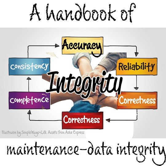
You can build the complete maintenance process around data visualization. There is no activity in maintenance that won’t get better by adding data visualization. When implementing data visualization in maintenance and reliability efforts, it’s essential to choose the right types of charts and graphs based on the specific goals and characteristics of the data. We had presented a set of tools in this chat and where it is best to use them to create an added value to the collected data. This will provide a clear and intuitive way to understand complex data, identify patterns, and make informed decisions.
Additionally, tools can enhance the capabilities of data visualization for reliability purposes. You can rely on the free online tools as a start. If you already have some implemented tools like business intelligence software and specialized reliability software, then you have a chance to use them creatively.
If you feel you need help with any of these ideas we discussed, request a Management Consultancy or Coaching Services From our Store


One Comment